
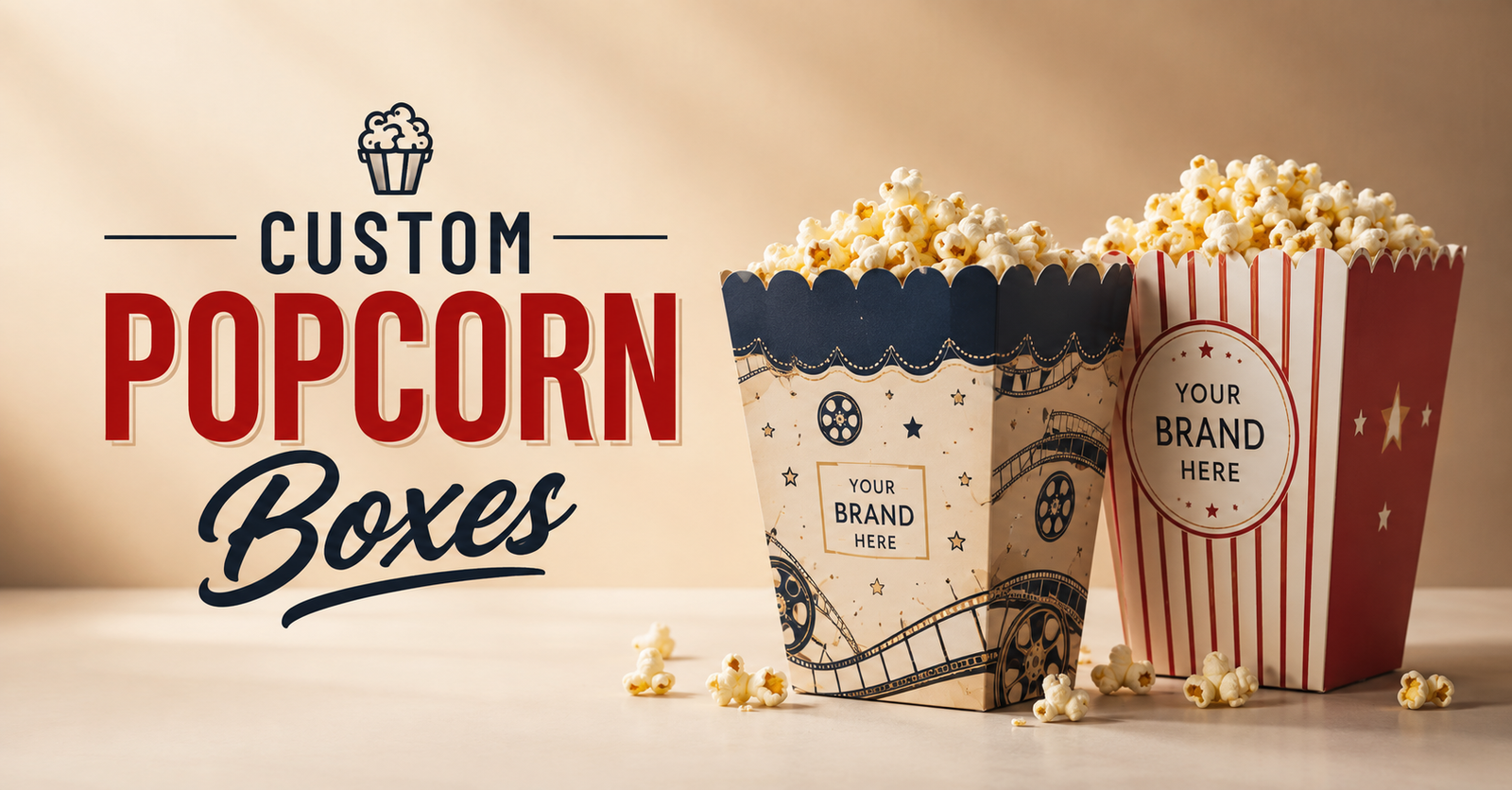
Custom Popcorn Boxes: Design Trends to Make Your Packaging Stand Out in 2026
Quick answer: Popcorn box design in 2026 is moving toward bold color blocking, retro cinema-inspired graphics, minimalist branding on kraft stock, and metallic foil accents for premium gifting lines. Since a popcorn box is held and seen for the entire length of a movie, game, or event, its design carries more sustained visual exposure than almost any other piece of packaging a venue owns — which is why more brands are treating the print as a deliberate design decision rather than an afterthought on top of a standard box shape.
Most popcorn packaging decisions start and end with "add the logo." That gets the branding job done at a basic level, but it misses what makes this particular format valuable: a customer holds a popcorn box for the length of an entire film, game, or event, which is a longer sustained view than almost any other branded object a venue hands out. The cinemas, stadiums, and event brands getting the most out of their packaging in 2026 are treating that extended visibility as a design opportunity, not just a branding checkbox.
Why Design Matters More for Popcorn Packaging Than You'd Think
A popcorn box sits in a customer's hands, on a stadium seat, or on an event table for the entire duration of whatever they're watching or attending often an hour or more of continuous, low-effort visual exposure. That's a very different exposure pattern from a napkin or a cup sleeve glanced at once. Design choices that would be wasted detail on a quickly-discarded item are actually worth the investment here, because customers, and the people sitting near them, are looking at the box for a genuinely extended period.
Trend 1: Bold, High-Contrast Color Blocking
Simple, high-contrast color blocks often just two or three colors used decisively rather than a busy multi-color pattern have become a dominant approach for custom popcorn boxes, particularly for cinemas and stadiums. The appeal is partly practical: bold blocking reads clearly from a distance and under varied lighting conditions, which matters in a dim theater or a stadium under artificial lights. It's also easier to apply consistently across multiple box sizes without the design losing coherence at smaller formats.
Trend 2: Retro & Nostalgic Cinema-Inspired Graphics
A wave of design nostalgia think mid-century cinema signage, classic striped patterns, hand-lettered typography reminiscent of old movie posters has found its way onto popcorn packaging as a way to lean into the format's inherent association with the classic movie-going experience. This works particularly well for independent and boutique cinemas trying to differentiate from the more corporate, minimal look of large chain multiplexes, turning the packaging itself into part of a retro brand experience rather than just a container.
Trend 3: Minimalist Branding on Kraft Stock
At the other end of the spectrum, a growing number of brands particularly event caterers and specialty retail popcorn brands are pairing natural kraft stock with a single-color logo and minimal supporting text. This reads as understated and premium rather than plain, and it doubles as a sustainability signal, since kraft's natural look already communicates an eco-conscious material choice before a customer reads any packaging claims. It's a particularly strong fit for weddings, upscale corporate events, and boutique retail popcorn brands where a loud, busy design would clash with the rest of the event's aesthetic.
Trend 4: Interactive & Playful Graphics for Family and Event Venues
For family entertainment venues, amusement parks, and kids' event catering, illustrated characters, patterns, or simple interactive elements (a small maze, trivia, or a "spot the difference" graphic on the box panel) add engagement value beyond pure branding. This trend works because it turns a few minutes of otherwise passive waiting while a kid finishes their popcorn into a small activity, which venues increasingly treat as part of the overall guest experience rather than a purely functional food container.
Trend 5: Metallic Foil Accents on Premium Gifting Lines
For retail and gifting-focused popcorn brands, foil stamping gold, silver, or a custom metallic color applied to a logo or key text has become a common way to signal premium positioning without a full redesign. This pairs particularly well with smaller-format gift boxes, where the box itself is part of what's being purchased, not just a container for the product inside. A metallic accent on an otherwise clean, restrained design tends to read as more considered than an all-over busy pattern competing for the same premium impression.
Trend 6: Seasonal & Limited-Edition Print Runs
Rather than committing to one static design year-round, more venues are running seasonal or limited-edition popcorn box prints tied to specific movie releases, holidays, or promotional windows. A reusable base template consistent logo placement and layout with a swappable color palette or seasonal graphic element keeps this approach cost-efficient, since the structural dieline stays the same while only the surface artwork changes between seasonal runs. This gives repeat customers something new to notice without requiring a full packaging overhaul multiple times a year.
Windows as a Design Feature
While windows are less common on popcorn boxes than on some other food packaging categories, a die-cut window showing the product inside has started appearing on retail and gifting-focused popcorn lines specifically, where letting customers see the popcorn's color and texture before purchase supports the same purchase-confidence effect windows create in other packaged food categories. For venues serving fresh popcorn on-site rather than selling a packaged retail product, this trend matters less the freshness is already obvious from the serving process itself.
Color Choices and What They Communicate
Color selection on popcorn packaging tends to carry associations worth being deliberate about. Classic red, white, and yellow striping remains the most immediately recognizable "cinema" association, and brands leaning into that palette are usually trying to trigger an instant, familiar read before a customer even processes the logo. Darker, more muted palettes deep navy, charcoal, forest green read as more upscale or contemporary, common in boutique cinemas and premium event catering. Bright, saturated colors outside the traditional red-yellow-white range tend to signal a more playful or family-oriented positioning, which is why they show up more often at amusement parks and kids' entertainment venues than at corporate screenings.
None of these associations are fixed rules plenty of brands successfully break from them deliberately to stand out but it's worth choosing a palette intentionally rather than defaulting to the classic stripe pattern simply because it's the most familiar option available.
Choosing a Design Direction Based on Venue Type
A few practical starting points, matched to common venue types:
- Large cinema chains and stadiums bold color blocking tends to perform best given distance-viewing and lighting conditions, along with the need for consistency across very high box volumes.
- Independent and boutique cinemas retro, nostalgic design directions help differentiate from larger corporate chains and lean into the format's classic associations.
- Weddings and upscale corporate events minimalist kraft-based designs generally fit the broader aesthetic better than bold or playful graphics.
- Family entertainment venues and kids' events interactive and illustrated graphics add engagement value appropriate to the audience.
- Retail and gifting popcorn brands metallic foil accents and windowed designs support the premium positioning these products are usually going for.
For businesses that also sell other packaged snacks alongside popcorn, it's worth coordinating design direction across the broader product line — reviewing options like food boxes as a category can help keep visual consistency across a full snack or concession lineup rather than treating popcorn packaging as an isolated design decision.
Frequently Asked Questions
What's the most cost-effective popcorn box design trend to start with? Bold, two-to-three color blocking is typically the most budget-friendly starting point, since it doesn't require detailed illustration work and still reads clearly at both small and large box sizes.
Do design trends matter as much for high-volume venues like stadiums? Yes, though the priority shifts slightly high-contrast, simple designs that stay legible under stadium lighting and read consistently across a large volume of units generally outperform more intricate designs in that specific setting.
Is a windowed popcorn box worth the extra cost? Mainly for retail or gifting-focused popcorn products where a customer is making a purchase decision before opening the box for on-site cinema or event serving, freshness is already obvious without a window.
How often should a venue refresh its popcorn box design? A full redesign isn't usually necessary more than every few years, but a modular base template supporting seasonal or promotional variations lets a venue refresh its look several times a year without that cost.
Can retro and modern design directions be combined? Yes many current designs blend a nostalgic layout or typography style with a more modern, high-contrast color palette, rather than treating retro and contemporary as opposing choices.
Final Word
A popcorn box earns more sustained attention than almost any other piece of packaging a venue hands out, simply because of how long a customer holds and looks at it. Treating that extended exposure as a design opportunity choosing a direction that actually fits the venue's audience and setting, rather than defaulting to a generic template is a low-cost way to get more marketing value out of packaging most venues are already buying anyway.
This article reflects general packaging design trends for the food-service and events industry as of August 2026. Design preferences vary by market and audience testing with your specific customer base is worthwhile before a full packaging rollout.






0 Comments